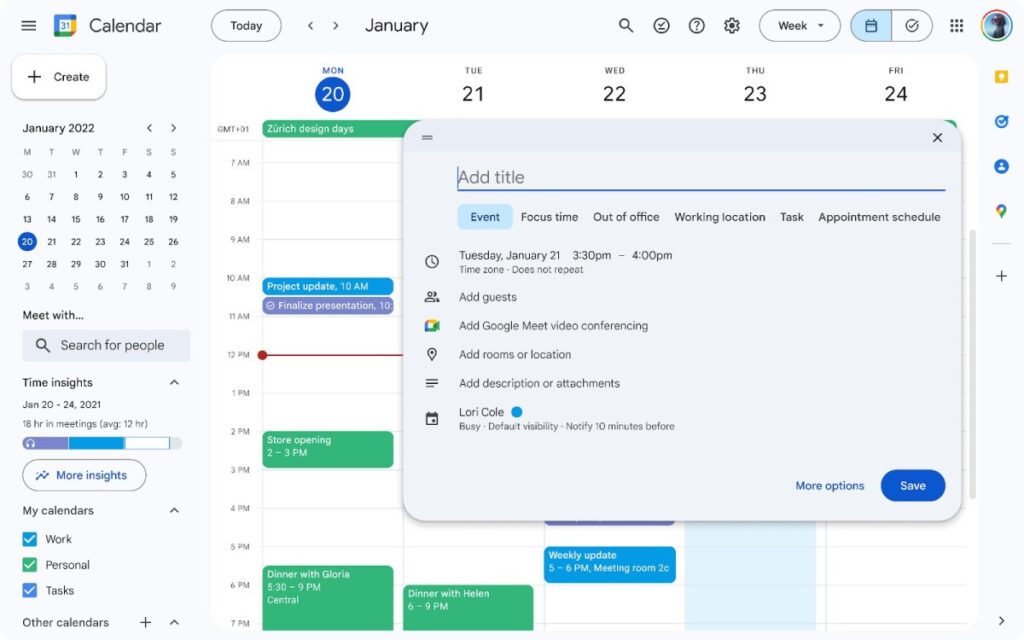
Google is revamping the Google Calendar web interface to align with Material Design 3 guidelines and adding support for dark mode.
The update applies to more “modern and accessible” controls such as buttons, dialogs and sidebars, the company said. Screenshots from the Google Workspace blog show that buttons and dialogs have rounded corners and a revised color scheme.
Google has also updated icons and typefaces throughout the Calendar UI to improve readability and clarity.
 Google Calendar finally supports dark mode Image credit: Google
The best part of this update (at least for me) is dark mode support. You can choose from three options: light mode, dark mode, or your device's default.
Google added that these design updates also apply to task view lists. This update will be rolled out in the coming weeks.


